
Heaven help me - I've been building a responsive infographic.
Specifically, I used Bootstrap to flesh out a not-really-infinite-scroll site that summarizes the findings of a survey - done by some #opengov types on social media use in the Vermont legislature. Getting the infographic confession aside, my point in mentioning it is that I wanted to include a map of responses by county, and that posed a dilemma.
I went with a responsive layout for the page because I know that 50% or more of the traffic will be from mobile clicks - the kind of viewing experience that makes a tricked-out slippy map either frustrating or useless. So I'd need something more flexible than my usual portfolio. Fortunately, a few months ago responsive-design-zealot Brad Frost had talked about using a combination of static and dynamic maps for the same purpose depending on available screen real estate. I thought it was cool but at the time had no use for it. Enter this recipe:
Ingredients:
1.) An API that provides both static and dynamic endpoints: Check. Mapbox FTW.
2.) A Responsive layout: Check. Bootstrap is out-of-the-box.
3.) A snippet of javascript to load the map according to screen size: Check. Repurposed here.
I knocked together a dynamic map using Tilemill and mapbox.js - this let me do some cool linking of SVG hover states and popup information windows. As a bonus I could disable pan and zoom to make it more like an interactive image and fit better into the overall page context. [Yes, haters, you're right - I should have done this with D3. Gimme a break; I'll get to it.] I then grabbed the map's PNG equivalent from the Mapbox Static API and plugged it into the code as the "static" option.
In Mr. Frost's original his "embed" option for larger screens is the standard google maps embed string. I wanted more features than were available with a standard mapbox embed, so I built the site separately with mapbox.js and "iframed" it in. This is just as much of an ugly hack as it seems, but it works.
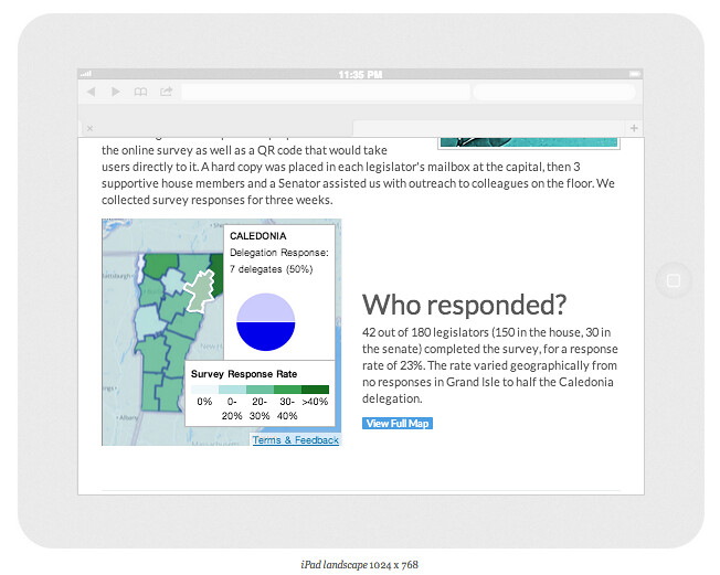
The result is a map that renders big and fully-interactive on tablets and larger:
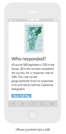
But shows a teaser image and a link to see more on a small screen:
This is obviously not a perfect solution, but it fits the purpose here. And it's also extendable - consider if you had to generate dozens of pages like this - you could do it just by programmatically changing the lat/lon or index value of both the static and the embed maps. Also worth noting is that this strategy works with both Mapbox and Google APIs.
As we move into a web that's even more solidly mobile-centric, we'll need to keep adapting maps with the resources we have available. It's actually a lot of fun trying to keep up.
Click here to see it in action
No comments:
Post a Comment